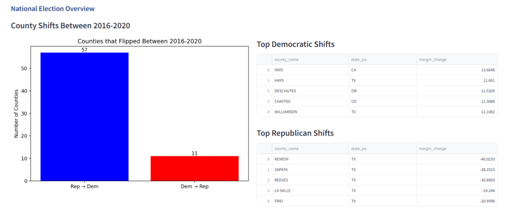
In the wake of recent political upheaval, I’m developing a comprehensive Power BI dashboard that visualizes voting pattern shifts across U.S. counties from 2016 to 2020. This analytical tool transforms raw electoral data into actionable insights, highlighting how 57 counties flipped from Republican to Democratic while 11 shifted from Democratic to Republican. The dashboard showcases dramatic margin shifts like Inyo County, California’s 13.7% Democratic gain and Kenedy County, Texas’s stunning 40% Republican surge. Drawing from county-level electoral databases and demographic indicators, this visualization suite will help campaign strategists, political scientists, and engaged citizens understand America’s evolving political landscape. My detailed analysis of these partisan realignments and their correlation with education levels and turnout metrics will be featured in an upcoming Medium article exploring the data stories behind our divided democracy.
Ballot Box to Data Point: Tracking America’s Political Pulse
Written by: